Hey!! Friends, we are back again with a new article on advanced CSS tutorials. Here we will start from where we finished in the previous article. In this, we are going to cover the new elements of CSS3. It is the last part of this CSS Tutorial. After this, we will move to Javascript.
If you missed the previous article then check once CSS Tutorial 108.
| What’s inside: CSS3 Box Sizing Flexbox Filters Media Queries FAQs: |
CSS3 Box Sizing

The box-sizing CSS property is done to alter the default CSS box model, which is commonly used by the browser to determine the widths and heights of the elements.
CSS3 box sizing property
<html>
   <head>
      <style>
         .div1 {
            width: 300px;
            height: 100px;
            border: 1px solid blue;
            box-sizing: border-box;
         }
         .div2 {
            width: 300px;
            height: 100px;
            padding: 50px;
            border: 1px solid red;
            box-sizing: border-box;
         }
      </style>
   </head>

   <body>
      <div class = "div1">technicalblog.in</div><br />
      <div class = "div2">technicalblog.in</div>
   </body>
</html>The “Old” border-box Reset
The earliest box-sizing: border-box; reset looked like this:
* {
  box-sizing: border-box;
}
This works fairly well, but it leaves out pseudo-elements, which can lead to some unexpected results. A revised reset that covers pseudo-elements quickly emerged
Universal Box Sizing with Inheritance
html {
  box-sizing: border-box;
}
*, *:before, *:after {
  box-sizing: inherit;
}
The reset gives you more flexibility than its predecessors — you can use content-box or padding-box (where supported) at will, externally worrying about a universal selector overriding your CSS.
CSS3 Flexible Box Layouts
The Flexbox Layout, called CSS Flexible Box Layout Module, is a new layout module in CSS3 made to improve the items like align, directions, and order in the container. Even when they are with known or even unknown size.
Why Flexbox?
Flexbox lets it more flexible for a developer to positioning items in a container with the minimum code.
The next simple layout requirements are either difficult or impossible to achieve with such tools, in any convenient, flexible way:
- It is vertically centering a block of content inside its parent. Making all the children of a container take up an equal amount of the available width/height, regardless of how much width/height is available. Making all columns in a multiple-column layout adopts the same height even if they contain different content.

Terminology
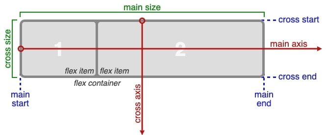
Before you read what the flexbox properties do, it’s necessary to understand the connected terminology. Here are definitions of the key flexbox terms,
- main-axis: The central axis of a flex container is the primary axis with which flex items are laid out. The direction of the main-axis is based on the flex-direction property of CSS3.
- main-start | main-end: The flex items are placed within the box, starting on the main-start side and moving toward the main-end side.
- main size: This width or height of a flexbox or flex item, in whatever major dimension, is the main size of the box. Its principal size property is thus either its width or height property, whatever the initial dimension.
- cross-axis: The axis perpendicular to the main axis is called the cross axis. Its direction depends on the main or central axis direction.
- cross-start | cross-end: Flex lines are filled with items and placed into the container, starting on the flex container’s cross-start side and moving toward the cross-end side.
- cross size: The width or height of a flex item in the cross dimension is the item’s cross size. The cross shape property is whatever the ‘width’ or ‘height’ in the cross dimension.
The flex-direction Property

The flex-direction attributes define in which direction the container wants to stack the flex items.
<!DOCTYPE html>
<html>
<head>
<style>
.flex-container {
  display: flex;
  flex-direction: column;
  background-color: green;
}

.flex-container > div {
  background-color: #f1f1f1;
  width: 100px;
  margin: 10px;
  text-align: center;
  line-height: 75px;
  font-size: 30px;
}
</style>
</head>
<body>
<h1>The flex-direction Property</h1>

<p>The "flex-direction: column;" stacks the flex items vertically (from top to bottom):</p>

<div class="flex-container">
  <div>1</div>
  <div>2</div>
  <div>3</div>
</div>

</body>
</html>
The flex-direction Property
The “flex-direction: column;” stacks the flex items vertically (from top to bottom):
The flex-wrap Property
The flex-wrap property defines whether the flex items should wrap or not.
.flex-container {
  display: flex;
  flex-direction: row-reverse;
}
CSS3 Filters

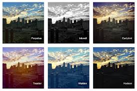
We can use CSS filters to add special effects to text, images, and other aspects of a web page without using images or other graphics.
Here a few tips for you if you are developing your website for a different browser. Then it may not be a good idea to use CSS filters because there is a possibility that it would not give any advantage.
Syntax:
filter: none | blur() | brightness() | contrast() | drop-shadow() | grayscale() | hue-rotate() | invert() | opacity() | saturate() | sepia() | url();There are several filter effects introduced in CSS3 that you can use to perform visual effect operations like a blur, balancing contrast or brightness, color saturation, etc.
Blur Example:
<!DOCTYPE html>
<html>
<head>
<style>
img.background {
  width: 100%;
  height: 100%;
  position: absolute;
  left: 0px;
  top: 0px;
  z-index: -1;
  filter: blur(35px);
}

img.square {
  display: block;
  margin: 0 auto;
  height: auto;
  max-width: 80%;
}
</style>
</head>
<body>

<h1>The filter Blur Property</h1>

<p>Blurred background:</p>

<img class="background" src="technicalblog.jpg" alt="technicalblog" width="300" height="300">
<img class="square" src="technicalblog.jpg" alt="technicalblog" width="500" height="500">
</body>
</html>
Brightness Example:
img {
  filter: brightness(250%);
}
Drop-shadow Example:
img{
-moz-box-shadow: 10px 10px 5px #888;
-webkit-box-shadow: 10px 10px 5px #888;
box-shadow: 10px 10px 5px #888;
}
Invert Example:
img{
-webkit-filter: invert(100%);
-moz-filter: invert(100%);
-o-filter: invert(100%);
-ms-filter: invert(100%);
filter: invert(100%);
}
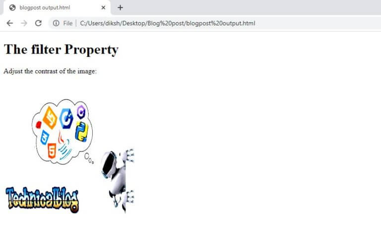
Contrast Example
<!DOCTYPE html>
<html>
<head>
<style>
img {
  filter: contrast(100%);
}
</style>
</head>
<body>

<h1>The CSS filter Property</h1>

<p>Adjusting the contrast of the image:</p>

<img src="technicalblog.jpg" alt="technicalblog" width="300" height="300">
</body>
</html>
Saturation Example:
img{
-webkit-filter: saturate(50%);
-moz-filter: saturate(50%);
-o-filter: saturate(50%);
-ms-filter: saturate(50%);
filter: saturate(50%);
}
FAQs:
1. What is a Media Query?
Ans: A media query is a new CSS technique introduced in CSS3.
It uses the @media rule to include a block of CSS properties only if a certain condition is true. Media queries allow to target a particular media type and then apply 0 or more expressions that check for the conditions of particular media features.
Example:
If the browser window is 400px or smaller, the background color will be lightblue:
@media only screen and (max-width: 400px) {
body {
background-color: lightblue;
}
}
2. Which of the following is the value of overflow property?
Ans: hidden, initial, scroll
3. If only one value is specified to border-radius property,
Ans: This radius will be applies to all four corners
4. External Style sheets can contain HTML Tags?
Ans: NO
Here, we completed our CSS Tutorial. I think this tutorial helps you a lot. After learning CSS from here, you can implement it in your blogs. If you are want to add some CSS in your WordPress theme, you can go with my friend’s blog intechverse – Internet of things. He has provided everything that you need to know how to add or use additional CSS on your site.
If you have any CSS questions then please contact us or put your question in the comment box.