Hey!! Buddies, we are back with a new article of tutorial CSS3 Tutorials. Here we will start from where we finished in the previous article. In this, we are going to cover the Advanced part of the CSS3 Tutorial.
If you missed the previous article, then check once CSS3 Tutorial 105.
| What’s inside: CSS Alignment Pseudo-classes Pseudo-elements Media Types Opacity Validation FAQS |
CSS Alignment
In CSS, there are several properties of alignment,
Text Alignment
The text alignment is a property where text can be aligned in the block-level element.
For example:
<!DOCTYPE html>
<html lang="en">
<head>
<meta charset="utf-8">
<title>Setting Text Alignment using CSS</title>
<style>
h1 {
text-align: left;
}
p {
width: 300px;
text-align: justify;
}
</style>
</head>
<body>
<h1>This is a example of text alignment</h1>
<p>Lorem ipsum dolor sit amet, consectetur adipiscing elit. Nam eu sem tempor, varius quam at, luctus dui. Mauris magna metus, dapibus nec turpis vel, semper malesuada ante. Vestibulum id metus ac nisl bibendum scelerisque non non purus. Suspendisse varius nibh non aliquet sagittis.</p>
</body>
</html> 
Center Alignment Elements
Center alignment is the most important property of CSS. To horizontally center a block element (like <div>), use margin: auto;
For example, the <div>container can be adjusted horizontally center by setting the left and right margins to auto.
<!DOCTYPE html>
<html lang="en">
<head>
<meta charset="utf-8">
<title>Example of CSS center alignment by auto property</title>
<style>
div {
width: 30%;
margin: 0 auto;
padding: 15px;
background: #9be4ff;
}
</style>
</head>
<body>
<div>This div container is center aligned horizontally.</div>
</body>
</html> 
Center Text-alignment:
To just center the text inside an block, we can use text-align: center;
<!DOCTYPE html>
<html>
<head>
<style>
.center {
text-align: center;
border: 3px solid blue;
}
</style>
</head>
<body>

<h2>Center Text</h2>

<div class="center">
<p>This text is centered.</p>
</div>

</body>
</html>
Aligning Elements Using the position Property
The position property in conjunction with the left, right, top, and bottom property use for aligning the elements with respect to the document’s viewport or containing the parent element.
<!DOCTYPE html>
<html lang="en">
<head>
<meta charset="utf-8">
<title>Example of CSS positioning</title>
<style>
p {
width: 200px;
padding: 10px;
}
.up {
background: #5a9eee;
position: absolute;
top: 0;
}
.down {
background: #b3d878;
position: absolute;
bottom: 0;
}
</style>
</head>
<body>
<p class="up">This paragraph is placed at the top of the document's viewport.</p>
<p class="down">This paragraph is placed at the bottom of the document's viewport.</p>
</body>
</html>

The Left and Right Alignment Using the float Property
The CSS float property we can be used to align an element to the left or right of its containing block that other content may flow along its side.
<!DOCTYPE html>
<html lang="en">
<head>
<meta charset="utf-8">
<title>Example of CSS floating</title>
<style>
div {
width: 200px;
padding: 10px;
}
div.red {
float: left;
background: #ff0000;
}
div.blue {
float: right;
background: blue;
}
</style>
</head>
<body>
<div class="red">Floated to left.</div>
<div class="blue">Floated to right.</div>
</body>
</html> 
CSS Pseudo-classes
What are Pseudo-classes?

The CSS pseudo-classes are used to add special effects to some selectors. Selectors example: hover, active, link, and so on.
A pseudo-class starts with a colon (:). Its syntax can be given with:
Syntax:
selector:pseudo-class { property: value; }Anchor Pseudo-classes
| Sr.No. | Value & Description |
|---|---|
| 1 | : Link – this is used to class to add a unique style to an unvisited link. |
| 2 | : Visited – we can use this class to add a special style to a visited link. |
| 3 | : Hover – this uses to class to add special style to an element when you mouse over it. |
| 4 | : Active – by using this class to add a special style to an active element. |
| 5 | :focus – by using this class, we can add the special style to an element, |
| 6 | :first-child – by using this class to add special style to an element that is the first child of some other element. |
| 7 | :lang – this is used to class to specify a language to use in a specified element. |
The :link pseudo-class
The below mention code demonstrate how to use the: link class to set the link colour. The possible values could be any colour name in any valid format.
<!DOCTYPE html>
<html>
<head>
<style type = "text/css">
a:link {color:#000000}
</style>
</head>

<body>
<a href = "">tech Link</a>
</body>
</html>
The :visited pseudo-class
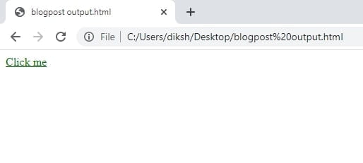
The below mentioned is the example which describes how to use the: visited class to set the color of visited links.
<html>
<head>
<style type = "text/css">
a:visited {color: #007600}
</style>
</head>

<body>
<a href = "">Click me</a>
</body>
</html>
The :hover pseudo-class
This pseudo-class adds a special effect to an element when our mouse pointer is over it. The below example demonstrates that when your mouse enters the box area, its background will change.
<html>
<head>
<style type = "text/css">
a:hover {color: #e04e00}
</style>
</head>

<body>
<a href = "">Hey!! I am here come to me:)</a>
</body>
</html> The :first-child Pseudo-class
The :first-child pseudo-class is matched as an element that is the first child element of some other element. The selector ol li:first-child in the below mention example select the first list item of an ordered list and removes the top border form it.
Example:
ol li:first-child {
   border-top: none;
}
The :last-child Pseudo-class
The:last-child pseudo-class suits an element that is the last child element of any other element. The selector ulli:last-child, in the example below, selects the last list item from an unordered list and removes the right border.
Example:
ul li:last-child {
   border-right: none;
}
The :nth-child Pseudo-class
The CSS3 includes a new:nth-child pseudo-class that allows you to target one or more particular children of a given parent element. The basic syntax like this selector can be given with:nth-child(N), where N is an argument, which can be a number, a keyword (even or odd), or an expression of the form xn+y where x and y are integers (e.g., 1n, 2n, 2n+1, …).
For example:
table tr:nth-child(2n) td {
background: #eee;
}
The style rules in the example above highlight the alternative table row, without adding any IDs or classes to the <table> elements.
The :lang Pseudo-class
The language pseudo-class: lang is allowed to construct selectors based on the language setting for specific tags. The: Lang pseudo-class, in the example below, defines the quotation marks for elements that are explicitly given a language value of no.
Example:
q:lang(no) {
quotes: "~" "~";
}
<p>Some text <q lang="no">A quote in a paragraph</q> Some text.</p>
Pseudo-classes and CSS Classes
Pseudo-classes can be combined with CSS classes.
The link with class="red", in the below-mentioned example will be displayed in red.
Example:
a.red:link {
/* style rule */ color: #ff0000;
}
<a class="red" href="#">Click me</a> /* HTML code snippet */
CSS Pseudo-elements
What are Pseudo-Elements?

A CSS pseudo-element is any keyword added to a selector that allows you to style a particular part of the selected element(s). For example,:: first-line can be used to modify the font of the first line of a paragraph.
Syntax
selector::pseudo-element {
  property:value;
}
The ::first-line Pseudo-element
The::first-line pseudo-element is applied to add a particular style to the first line of a text.
The following example formats the first line of the text in all <p> elements:
p::first-line {
color: #ff0000;
font-variant: small-caps;
}
The ::first-letter Pseudo-element
The::first-letter CSS pseudo-element uses styles to the first letter of the opening line of a block-level element, but it will happen only when not preceded by other content (such as images or inline tables).
p::first-letter {
  color: #ff0000;
  font-size: xx-large;
}
The Punctuation that precedes or immediately follows the first letter is included in the match. The Punctuation also includes any Unicode character defined in the open (Ps), close (Pe), initial quote (Pi), final quote (Pf), and other Punctuation (Po) classes.
The ::before and ::after Pseudo-element
The:: before and:: after pseudo-elements can include generated content either before or after an element’s content. The CSS content property uses in conjunction with these pseudo-elements to insert the generated content.
This helps additional decorating an element with rich content that should not be part of the page’s actual markup. You can insert the regular strings of text or an embedded object such as images and other resources using these pseudo-elements.
Example:
h1::before {
content: url("images/marker-left.gif");
}
h1::after {
content: url("images/marker-right.gif");
}
Pseudo-elements and CSS Classes
Usually, we need to style only a particular paragraph of text or other block-level elements with these pseudo-elements. That’s where declaring a class to the pseudo-element comes into play. The pseudo-elements can be combined with the CSS classes to produce the effect, particularly for the class elements.
The following sample’s style rules will display the first letter of all paragraphs with the class=” article” in green and size of xx-large.
Example:
p.article::first-letter {
color: #00ff00; font-size: xx-large;
}
CSS Media Types

One of the most important style sheets articles is that you can specify separate style sheets for different media types. This is one of the best ways to build printer-friendly Web pages — Assign a different style sheet for the “print” media type.
Creating Media Dependent Style Sheets
Three methods are commonly used to specify the media dependencies for style sheets:
Method 1: Using the media At-rules syntex
The @media the rule is used to define different style rules for different media types in a single style sheet. It is usually followed by a comma-separated list of media types and CSS declarations block containing the style rules for the target media.
The style declaration in the below example tells the browser to display body content in 14 pixels Arial font on the screen, but in case of printing, it will be in a 12 points Times font. However, the value of line-height property is set to 1.2 for both of them:
Example:
@media screen{
body {
color: #32cd32;
font-family: Arial, sans-serif;
font-size: 14px; }
}
@media print {
body {
color: #ff6347;
font-family: Times, serif;
font-size: 12pt;
}
}
@media screen, print {
body {
line-height: 1.2;
}
}
Method 2: Using the import At-rules syntax
The @import rule is another way of arranging the style information for a specific target media; just specify the comma(,)-separated media types after the URL of the imported in the style sheets.
@import url("css/screen.css") screen;
@import url("css/print.css") print;
body {
background: #f5f5f5;
line-height: 1.2;
}
The print media standard in the @import statement directs the browser to load an external style sheet (print.css) and only uses print media.
Method 3: Using the <link> element syntax
The media property on the <link> element is applied to define the target media for an external style sheet within the HTML document.
Example:
<link rel="stylesheet" media="all" href="css3/common.css">
<link rel="stylesheet" media="screen" href="css3/screen.css">
<link rel="stylesheet" media="print" href="css/print.css">
In that example, the media property directs the browser to load an external style sheet “screen.css” and use its styles only for the screen while “print.css” for printing purposes.
CSS3 Media Types
| Value | Description | |
| all | Used for all media type devices | |
| Used for printers | ||
| screen | Used for computer screens, tablets, smart-phones, etc. | |
| speech | Used for screenreaders that “reads” the page out loud |
CSS Opacity
Cross Browser Opacity
Opacity is now another part of the CSS3 specifications, but it was present for a long time. However, the older browsers have different ways of controlling the opacity or transparency.
Here is the latest up to date syntax for CSS opacity in all current browsers.
img {
opacity: 0.5;
}

img:hover {
opacity: 1.0;
}
The first CSS block is related to the code in the above mention Example. In addition, we have added what should happen when a user hovers over on one of the images. In this case, we want the image to NOT be transparent when a user hovers over it. The CSS opacity for this is opacity:1;
When a mouse pointer moves away from the image, the image will be transparent again.

CSS Opacity in Internet Explorer 8 and lower
Internet Explorer 8 and newer version supports a Microsoft-only property “alpha filter” to control an element’s transparency.
Example:
p {
    filter: alpha(opacity=50);
    zoom: 1;  /* Fix for IE7 */
}
CSS Image Opacity
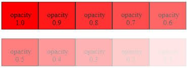
You can also make transparent images using CSS Opacity.
The three images in the below illustration are all from the same source image. Here, The only differences between them are the level of their opacity.

CSS Validation
As a beginner, it is widespread that you will make a confusion in writing your CSS code. Incorrect or non-standard code may cause unexpected issues in how a page presented or functions in a web browser.
If we use CSS, our code needs to be correct. Improper code may cause unexpected results in how the page looks or functions.
But if you want to validate a CSS style sheet embedded in an (X)HTML document, you should first check that the (X)HTML, which is you using, is valid or not.
Here, The Tool to check the validity of (X)HTML document: Validate (X)HTML document.
We can use the following tools to check the validity of your CSS.
| W3C CSS Validator (World Wide Web Consortium), That validator validates your CSS by each file upload, right input, or using URI – one page at a time. This validator assists you in locating everything the errors in your CSS. | |
| The WDG CSS check validator allows you to validate your CSS by primary input, file upload, and URI. Errors will be listed by line and column numbers if you have any. Errors usually come with links to explain the reason for the error. |

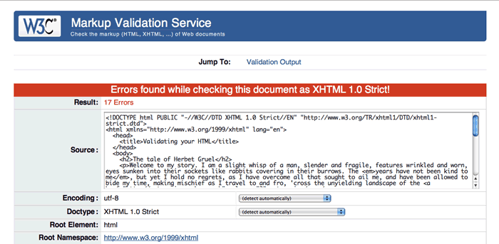
if there is any error occurred then shown like this:

A CSS validator validates your Cascading Style Sheets to ensure that they comply with the CSS standards set by the W3 Consortium. A few validators will also tell us which CSS features are supported by which browsers (since not all browsers are equal in their CSS implementation).
Why Validate Your HTML Code?
Open the W3C online validator in a new tab or new window so that you can switch between the validator and this article as you go through with the example. (You can also validate pages in the W3C validator directly from the Opera browser by right/Ctrl-clicking and selecting the “Validate” option.)
The validator has three tabs available across the top of the interface:
- The Validate by URI: Allows you to enter the address of a page already on the internet for validation.
- · The Validate by File Upload: Allows you to upload a local HTML file for validation.
- · Validate by Direct Input: Allows you to paste HTML directly into the window for validation.
FAQS:
1. What is the use of border-radius in CSS3?
Ans: With the CSS3 “border-radius” property, you can give rounded corners to any element.
If you specify the only one value for the border-radius property, this radius will be applied to all four corners. However, if required, you can specify a radius for each corner separately.
Syntax: border-radius: 15px 50px 30px;
2.What is “W3C online validator”?
Ans: It is a tool for checking validation of HTML and CSS.W3C CSS Validator (World Wide Web Consortium) validator helps you to locate all the errors in your CSS.
3. What is cascade?
Ans: Cascade is a method of defining the importance (weight) of individual styling rules, thus allowing conflicting rules to be sorted out should such rules apply to the same selector.
Declarations with increased weight take precedence over a declaration with normal weight:
P {color: green! important} /* increased weight /
P (color: black} / normal weight */
4. Alpha channel in RGBA specifies the ________
Ans: the opacity for a color
5.Opacity has a default initial value of ________
Ans: Opacity has a default initial value of 1 (100% opaque).
In this article, we completed our advanced part of the CSS Tutorial. The coming article will contain “The new elements in CSS3” in which we learn more interesting things like animation, gradient, shadows and so on. Please stay with us.