Hello friends, welcome back to our new tutorial of Matplotlib Introduction in Python tutorial Series. If you are missed the previous article on the Python tutorial series then click here.
Matplotlib Introduction
Matplotlib is the “grandfather” library of data visualization with Python. It was created by John Hunter. He created it to try to replicate MatLab’s (another programming language) plotting capabilities in Python. So if you happen to be familiar with matlab, matplotlib will feel natural to you.
It is an excellent 2D and 3D graphics library for generating scientific figures.
Some of the major Pros of Matplotlib are:
- Generally easy to get started for simple plots
- Support for custom labels and texts
- Great control of every element in a figure
- High-quality output in many formats
- Very customizable in general
Matplotlib allows you to create reproducible figures programmatically. Let’s learn how to use it! Before continuing this lecture, I encourage you just to explore the official Matplotlib web page: http://matplotlib.org/
Installation
You’ll need to install matplotlib first with either:
conda install matplotlibor pip install matplotlib
Importing
Import the matplotlib.pyplot module under the name plt (the tidy way):
import matplotlib.pyplot as pltYou’ll also need to use this line to see plots in the notebook:
%matplotlib inlineThat line is only for jupyter notebooks, if you are using another editor, you’ll use: plt.show() at the end of all your plotting commands to have the figure pop up in another window.
Some Basic Examples of Matplotlib Introduction:
Let’s walk through a very simple example using two numpy arrays:
import numpy as np
x = np.linspace(0, 5, 11)
y = x ** 2
#Print x
x
Output:
array([ 0. , 0.5, 1. , 1.5, 2. , 2.5, 3. , 3.5, 4. , 4.5, 5. ])
#print y
y
Output:
array([  0.  ,   0.25,   1.  ,   2.25,   4.  ,   6.25,   9.  ,  12.25,
        16.  ,  20.25,  25.  ])
Basic Matplotlib Commands
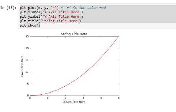
We can create a very simple line plot using the following ( I encourage you to pause and use Shift+Tab along the way to check out the documentation strings for the functions we are using).
plt.plot(x, y, 'r') # 'r' is the color red
plt.xlabel('X Axis Title Here')
plt.ylabel('Y Axis Title Here')
plt.title('String Title Here')
plt.show()
Output:

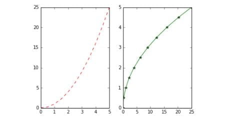
Creating Multi plots on Same Canvas
# plt.subplot(nrows, ncols, plot_number)
plt.subplot(1,2,1)
plt.plot(x, y, 'r--') # More on color options later
plt.subplot(1,2,2)
plt.plot(y, x, 'g*-');
In this article we have presented the Matplotlib introduction part, after this we will discuss about the other topics of matplotlib.