Hey!! Fellows, we are back again with a new article on advanced CSS tutorial. Here we will start from where we finished in the previous article. In this, we are going to cover the new elements of CSS3.
If you missed the previous article then check once CSS Tutorial 107.
| What’s inside: CSS3 3D Transforms Transitions Animations Multi-Column Layouts FAQS: |
CSS3 3D Transforms
By using 3d transforms, we can move an element to the x-axis, y-axis, and z-axis. In 3D space, the rotations have three degrees of liberty, that together describe a single axis of rotation. The axis of rotation is defined by an [x, y, z] vector and pass by the origin
Syntax:
The number of rotation created by rotate3d() is specified by three <number>s and one <angle>. The <number>s describe the x-, y-, and z-coordinates of the vector indicating the axis of rotation. The <angle> describes the angle of rotation; if positive, the change will be clockwise; if negative, it will be counter-clockwise.
rotate3d(x, y, z, a)There are several methods of 3D transmition.
Methods of 3D transforms
| Sr.No. | Value & Description |
| 1 | matrix in 3d {n,n,n,n,n,n,n,n,n,n,n,n,n,n,n,n}: it is used for transforms the element by using 16 values of matrix |
| 2 | translate3d(x,y,z):used for transforms the element by using x-axis,y-axis and z-axis |
| 3 | translateX(x):Uses for transforms the element by using x-axis |
| 4 | translateY(y): Applied to transforms the element by using the y-axis |
| 5 | translateZ(z): Applied to transforms the element by using y-axis |
| 6 | scaleX(x): Applied to scale transforms the element by using the x-axis |
| 7 | scaleY(y): Uses for scale transforms the element by using the y-axis |
| 8 | scaleY(y): Used to changes the element by using the z-axis |
| 9 | rotateX(angle): Used to rotate modifies the element by using the x-axis |
| 10 | rotateY(angle): Applied to rotate transforms the element by using y-axis |
| 11 | rotateZ(angle): Uses for rotating transforms the element by using the z-axis |
Here example of some methods:
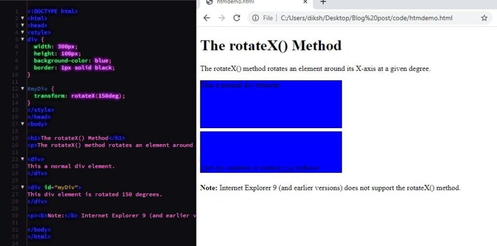
The rotateX() Method
The rotateX() method rotates an element around its X-axis at a given degree:
<!DOCTYPE html>
<html>
<head>
<style>
div {
  width: 300px;
  height: 100px;
  background-color: blue;
  border: 1px solid black;
}

#myDiv {
  transform: rotateX(150deg);
}
</style>
</head>
<body>

<h1>The rotateX() Method</h1>
<p>The rotateX() method rotates an element around its X-axis at a given degree.</p>

<div>
This a normal div element.
</div>

<div id="myDiv">
This div element is rotated 150 degrees.
</div>

<p><b>Note:</b> Internet Explorer 9 (and earlier versions) does not support the rotateX() method.</p>

</body>
</html>

The rotateY() Method
According to the provided degree, the CSS 3D rotateY() method is applied to rotate an element around its Y-axis.
<!DOCTYPE html>
<html>
<head>
<style>
div {
  width: 300px;
  height: 100px;
  background-color: skyblue;
  border: 1px solid black;
}

#myDiv {
  transform: rotateY(150deg);
}
</style>
</head>
<body>

<h1>The rotateY() Method</h1>
<p>The rotateY() method rotates an element around its Y-axis at a given degree.</p>

<div>
This a normal div example.
</div>

<div id="myDiv">
This div element is rotated 150 degrees.
</div>
</body>
</html>
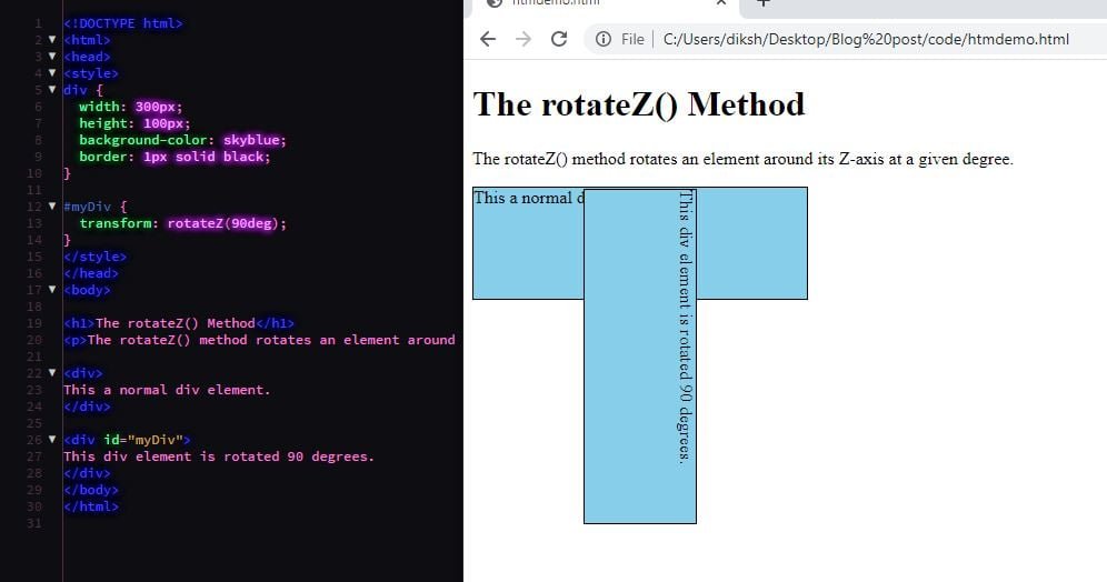
The rotateZ() Method
The CSS 3D rotateZ() method is used to rotate an element around its Z-axis according to the given degree.
<!DOCTYPE html>
<html>
<head>
<style>
div {
  width: 300px;
  height: 100px;
  background-color: skyblue;
  border: 1px solid black;
}

#myDiv {
  transform: rotateZ(90deg);
}
</style>
</head>
<body>

<h1>The rotateZ() Method</h1>
<p>The rotateZ() method rotates an element around its Z-axis at a given degree.</p>

<div>
This a normal div element.
</div>

<div id="myDiv">
This div element is rotated 90 degrees.
</div>
</body>
</html>

CSS3 Transitions
CSS transitions present a way to control the animation speed while changing the CSS properties.
Normally, we can say that a transition occurs when an element changes from one state to another, and the browser fills in that state change with a sequence of in-between frames. It has a beginning and also an end state.
There are multiple type of transition is present in CSS3:
- transition
- transition-delay
- transition-duration
- transition-property
- transition-timing-function
The sample below the box will change its background color over 1 second in a linear fashion.
Transition Property
The CSS transition-property specifies the name of the CSS property. The transition effect is for (the transition effect will start when the specified CSS property changes). Additionally, all keyword value may be used to transition all properties of an element.
<!DOCTYPE html>
<html>
   <head>
      <style>
         div {
            width: 150px;
            height: 150px;
            background: blue;
            transition: height 3s;
         }
         div:hover {
            height: 250px;
         }
      </style>
   </head>
   <body>
      <h1>technicalblog</h1>
      <p>Hover over the below box to change its height.</p>
      <div></div>
   </body>
</html>
Transition Duration
Use to the transition–duration property, normally used as part of transition shorthand, is used to define the duration of a specified transition. i.e., the length of time it will take for the targeted element to the transition between two defined states.
.box {
  background: #2db34a;
  border-radius: 6px;
  transition-property: background, border-radius;
  transition-duration: .2s, 1s;
  transition-timing-function: linear;
}
.box:hover {
  background: #ff7b29;
  border-radius: 50%;
}
Transition timing function
The property, normally used as part of transition shorthand, is used to define a function that describes how a transition will proceed over its duration, allowing a transition to change speed during its course.
.box {
  background: #2db34a;
  border-radius: 6px;
  transition-property: background, border-radius;
  transition-duration: .2s, 1s;
  transition-timing-function: linear, ease-in;
}
.box:hover {
  background: #ff7b29;
  border-radius: 50%;
}
Transition Delay
The property is used to specify the amount of time to wait before a transition effect is animated. It allows an effect to start after some amount of time from when it is applied. The time offset specified using transition-delay will offset the animation by the amount specified.
.box {
  background: #2db34a;
  border-radius: 6px
  transition-property: background, border-radius;
  transition-duration: .2s, 1s;
  transition-timing-function: linear, ease-in;
  transition-delay: 0s, 1s;
}
.box:hover {
  background: #ff7b29;
  border-radius: 50%;
}
CSS3 Animation
The CSS Animation properties are a more powerful alternative to transitions. In animation, we can change multiple properties at the same time.
For using CSS animation, we must first define some keyframes for the animation. Keyframes carry what styles the element will have at certain times. Now, the question is what is Keyframes? are list defining what should happen over the course of the animation.
When we use the style in@keyframes rule, the animation will gradually change from the current style to the new style at certain times.
The keyframe selector to a keyframe style rule begins with a percentage (%) or the keywords from (same as 0%) or to (same as 100%).
Syntax of keyframes:
@keyframes example {
  from {property: value;}
  to {property: value;}
}
The properties of the animation are:
Animation-name: used to refers to the name of the @keyframes at-rule describing the animation’s keyframes.
Animation-duration: configures the length of time that animation should take to complete one cycle.
Animation-timing-function: The property is used to specify a timing function that defines the speed over time of an object being animated.
It describes how an animation will going over one cycle of its duration, allowing it to change speed during its course.
Animation-delay: used to Configures the delay between the time the element is loaded and the beginning of the animation sequence.
Animation-iteration-count: used to arranges the number of times the animation should repeat; you can choose infinite for repeating the animation indefinitely.
Animation-direction: used to build whether or not the animation should alternate direction on each run through the sequence or reset to the start point and repeat itself.
Animation-fill-mode: this property is used for Configures what values are applied by the animation before and after it is executing.
Animation-play-state: this property lets you pause and resume the animation sequence.
Here a simple example of animation:
<!DOCTYPE html>
<html>
<head>
<style>
.logo {
  margin: 0 auto;
  margin-top: 70px;
  width: 250px;
  height: 250px;
  background-color: black;
  border: 15px solid #337ab7;
  animation: square-to-circle 1s .83s infinite cubic-bezier(1,.015,.295,1.225) alternate;
}

@keyframes square-to-circle {
  0%  {
    border-radius:0 0 0 0;
    background:black;
    transform:rotate(0deg);
  }
  25%  {
    border-radius:25% 25% 25% 25%;
    background:black;
  }
  50%  {
    border-radius:50% 50% 50% 50%;
    background:darkblue;
  }
  75%  {
    border-radius:75% 75% 75% 75%;
    background:black;
  }
  100% {
    border-radius:100% 100% 100% 100%;
    background:black;

  }

}
</style>
</head>
<body class="body">
<h2> technicalblog </h2></header>
<div class="logo"></div>
</body>
</html>
technicalblog
technicalblog
CSS3 Multi-Column Layouts
CSS Multi-column Layout is a module of CSS that adds support for multi-column layouts. The support includes establishing the number of columns in a layout, as well as how the content should flow from column to column, gap sizes between columns, and column dividing lines (which are known as column rules) along with their appearance.
Creating Multi-Column Layouts
The CSS3 has started the multi-column layout module while creating multiple column layouts easily and efficiently.
There are some property for creating multi-column layouts:
| Sr.No. | Value & Description |
| 1 | Column-count: applied to count the number of columns that element should be divided. |
| 2 | Column-fill: applied to decide how to fill the columns. |
| 3 | Column-gap: Applied to decide the gap between the columns. |
| 4 | Column-rule: applied to specifies the number of rules. |
| 5 | Rule-color: applied to specifies the column rule color. |
| 6 | Rule-style: Used to specifies the style rule for the column. |
| 7 | Rule-width: Used to specifies the width. |
| 8 | Column-span: applied to specifies the span between columns. |
For example:
<!DOCTYPE html>
<html>
   <head>
      <title>Three Column HTML Layout</title>
   </head>
   <body>
      <table width = "100%" border = "0">
         <tr valign = "top">
            <td bgcolor = "#aaa" width = "20%">
               <b>Main Menu</b><br />
               HTML<br />
               CSS<br />
               PERL...
            </td>

            <td bgcolor = "#b5dcb3" height = "200" width = "60%">
               Technicalblog
            </td>

            <td bgcolor = "#aaa" width = "20%">
               <b>Right Menu</b><br />
               HTMl<br />
               CSS<br />
               PERL...
            </td>
         </tr>
      <table>
   </body>
</html>|
Main Menu HTML CSS PERL… | Technicalblog |
Right Menu HTMl CSS PERL… |
Halp full😍
Keep growing stay healthy
Another very helpful tutorial..thanks for posting.
❤️ always amazing keep it up 👍
Nice